


Drawing Out Ideas
Todays News
SRQ DAILY FRESHLY SQUEEZED CONTENT EVERY MORNING
THURSDAY DEC 1, 2016 |
BY JACOB OGLES
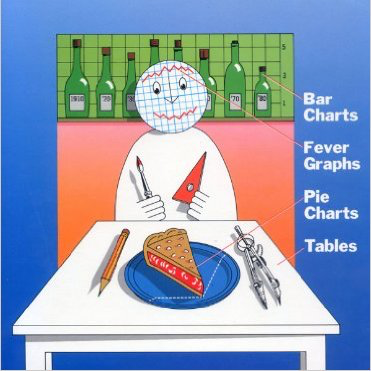
Picture from cover of Nigel Holmes' "Designer's Guide to Charts & Diagrams"
A picture may be worth 1,000 words of story-telling, but an informational graphic can sometimes convey hard data as well as any research paper. “Explanation Designer” Nigel Holmes developed a reputation as one of the best graphic makers in the business during a stint at TIME magazine and has since published books of valuable factoids, including The Smallest Ever Guide to the Internet. Holmes will share his craft as a lecturer at the PINC Conference in Sarasota on December 8, but he spoke with SRQ in advance of his trip.
When you are taking a complex idea and trying to make a self-explanatory graphic, what do you try to zero in on? Holmes: 1. Who is the audience? When I'm explaining something for people who know the subject, or for an academic audience, the result will be different from explaining something for a general reader or viewer. 2. What's the main story or point of the graphic? People are busy; get to the point quickly! 3. Although it's somewhat frowned upon within the data field, I do take the look of the finished piece (its aesthetics) seriously. If it is attractive, people are more likely to read it, whether the graphic is for an academic journal or a general reader publication. Whenever possible I try to bring a smile to the audience. Of course, I will never do this with certain subjects: death, war, guns.
Why do pictures make it easier for people to understand complex statistics or scientific theories? Because pictures immediately draw you in. There will be words in the graphic, too, but you can't help looking at the pictures first. In the same way that a verbal metaphor can help the understanding of a complex piece of text, a visual metaphor greatly helps the reader to grasp the meaning of a complex scientific experiment or an obscure economic principle.
How do you believe information graphics have changed or will continue to change journalism or academia in the future? The main change since I started doing published graphics in 1964 is that we use a computer to make them. It's so much easier, faster and there's no need for an elaborate drawing board and drafting tools. The computer and the web have led us to be able make pictures move, to add sound and to sequence images to tell the story of the data, or the different stages of an event, or whatever is being explained. In the future, as more and more print-based media outlets disappear, all graphic designers will have to know how to code (for all digital platforms: desktop and mobile) because that's where their work will appear.
Picture from cover of Nigel Holmes' "Designer's Guide to Charts & Diagrams"
« View The Thursday Dec 1, 2016 SRQ Daily Edition
« Back To SRQ Daily Archive